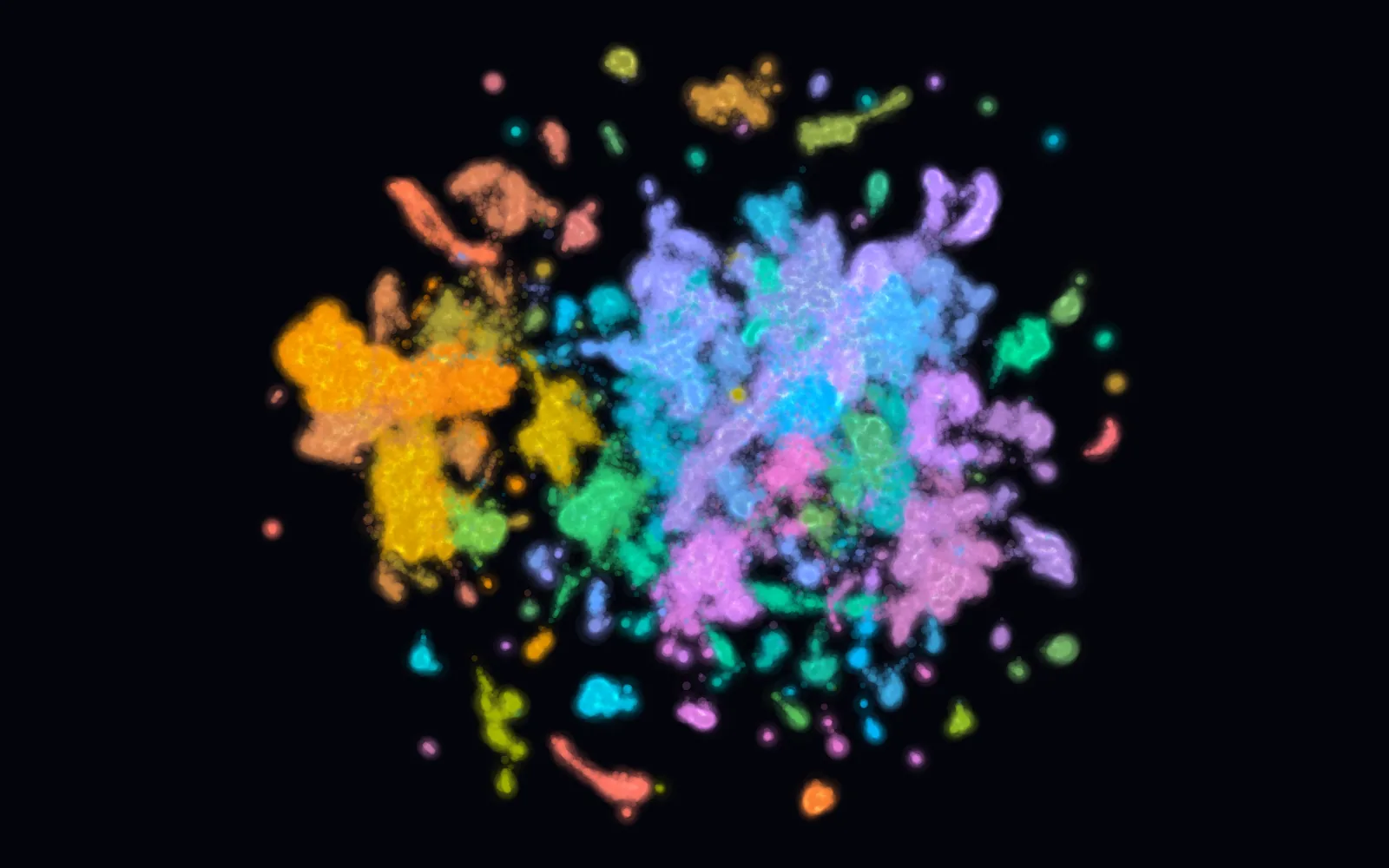
Every dot is a subreddit. Communities that share commenters sit together, so the map sorts itself into neighbourhoods: games beside their fan art, cities beside their sports teams, languages on islands of their own.
Every community with at least 10,000 subscribers that is active enough to place.
Area tracks subscribers, so r/funny is a large disc and a 12,000-member hobby is a small one.
69 groups found in the network of similarities, coloured so that neighbouring groups get neighbouring hues.
Select a subreddit and lines run to the communities whose commenters overlap with it most.
Position comes from shared audiences, not topics or keywords: two subreddits are close when the same people comment in both. The map has a flat view and a 3D one that turns slowly, so the depth reads from the motion.
Every subreddit at or above 10,000 subscribers (42,521 of them), with member counts and descriptions, from the Arctic Shift API.
Six months of public Reddit comments, April to September 2026, from the monthly archives published on Academic Torrents.
comments read. Only two fields survive from each: who wrote it, and where.
Text, scores and timestamps are thrown away as the archive streams past, along with deleted accounts, AutoModerator and accounts named as bots. Membership and activity are different things: a subreddit can have millions of subscribers and no comments at all because its community moved elsewhere, so both are checked.
Seven steps, from 303 GB of archives to one page.
Each month's archive becomes a list of (commenter, subreddit) pairs, one per commenter per community. A month is about 50 GB and takes 45 minutes to stream.
Someone active in a single subreddit tells us nothing about how communities relate, and someone active in a hundred makes everything look alike. Only commenters in 2 to 100 subreddits count.
A subreddit needs more than 30 distinct commenters across the six months, and at least one in the latest three. A confidently wrong position is worse than none, and a community silent since spring has no place on a map of Reddit now.
Huge subreddits share commenters with everything simply by being huge. Each commenter–subreddit link is weighted by how much more often it occurs than chance (positive pointwise mutual information), so distinctive overlap counts and sheer size does not.
The weighted matrix, 34,153 subreddits by 20 million commenters, is compressed to 150 numbers per subreddit, keeping the strongest patterns of shared audience. The method follows Waller & Anderson (Nature, 2021).
Each subreddit is linked to its 15 most similar, giving 381,777 links. A community detection algorithm (Leiden) finds 69 groups in that network, and their colours follow the order the groups sit in, so related groups look related.
UMAP flattens the 150 dimensions onto a page, keeping each subreddit's neighbours near it as best two dimensions allow. The 3D view is the same layout lifted into depth, so switching between them unfolds the map rather than shuffling it.
A flat map cannot hold 150 dimensions, so something gives. What survives best is the large scale: regions that sit far apart really are unrelated. What survives least is fine detail. Two dots touching may share little, and a subreddit's closest relatives can sit a little way off. On average, about 3 of a subreddit's 10 most similar communities are among the 10 dots nearest it on screen.
Use position to find a neighbourhood, and the links to read it.
Select a subreddit and its lines and Most similar list come straight from the data, not from the layout. Some limits are worth knowing. Six months favours active communities, so quiet subreddits with fewer than 30 commenters in that time are left off. Group names are a judgement, written from each group's members and descriptions, and a mixed group gets a compromise name. Everything here is a snapshot of who commented between April and September 2026.
Search for a subreddit, follow its links, or switch to 3D and let it turn.
Explore the map